As part of I for Style’s commitment to excellence and innovation in design and decoration, we regularly attend informative industry seminars, conferences and gatherings with like-minded peers, keeping us on the front line of new trends and forecasts. Today was no exception.
Space Furniture in Alexandria, Sydney hosted a great line-up of talented colourists, designers and architects who were our guest speakers and they didn’t disappoint!
Dulux colour expert Andrea Lucena-Orr, talked at length about the colours that are set to soar in 2018. The theme for 2018 is encapsulated in the word ‘Balance’ and the reasoning behind this concept is beautifully described in the following phrases: As life moves into the fast lane, the desire to shift gears and slow down takes over. The Dulux colour forecast for 2018 harnesses the power of colour to balance the complex challenges of everyday life.
Over the next three weeks we’ll look at the colour palettes chosen and what they represent.
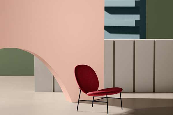
The first palette ‘Kinship’ exudes warmth. It represents a beacon of hope. As this gentle revolution gains momentum, we switch off the noise and create space for compassion and kindness. Key colours include: Herbalist, Very Terracotta, Maiko, Outrages Red, Hildegard, Ruski amongst others.
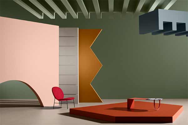
The Kinship trend brings together a diverse mix of cultural references. Furniture forms are inspired by traditional crafts such as wood turning, knitting and sewing. Details are informed by familiar and traditional architectural treatments, while colour is simple and uncomplicated, providing warmth without overwhelming the senses. Punctuations of red hint at Eastern influences.
Folklore revival. Kinship focuses on renewing our faith in one another and the world around us. The Kinship colours work beautifully together creating a harmonious living and working spaces. We find new joy in reviving long-held traditions. A colourful mish-mash of cultural influences ignites our sense of community.
Photos: www.dulux.com.au
Dulux Colour Forecast 2018!