I’m a big fan of colour, not least because it’s one of the easiest and most effective ways to change any interior. Here’s a great article by Pantone that sets the course for this year and beyond:
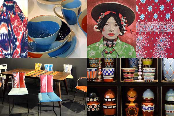
Years of globalization and the movement of people as well as product has brought about a globalized colour palette and design aesthetic that has evolved, not premeditated. Adapting this colour mood specifically into the world of home furnishings and interior design is a colour story Pantone calls ‘Meanderings’ a theme featured in the PANTONEVIEW home and interiors 2019. Traveling the world and tempting the senses, Meanderings, blends different cultures and celebrates our diversity.
Whether traveling in person or in the imagination to destinations known and unknown, Meanderings implies a winding course done at a leisurely pace that often reveals unexpected treasures and pleasures. Conjuring up various ports of call, colours highlighted include a tropical Island Green, Brilliant Blue, and Wild Orchid, a composed Canal Blue joined to a robust red Cabernet, an exotic russet tone called Spice Route sweetened by a honeyed Chai Tea, and Aurora Red, an intense red hue found in the Aurora Borealis viewed in northern climes.
Credits: Laurie Pressman-Pantone Colour Institute Photo: Pantone Colour Institute
Colour Trends