I love the colour green so I was pretty pleased to learn that the Pantone Colour of 2017 is Greenery. Green speaks of new life, fresh beginnings, vitality, joy and I’m sure there’s lots of other adjectives one could use to describe the colour green.
Green is a wonderful colour to use in a room with very little or no natural light; it really makes the space come alive, infusing it with a wonderful vitality. With a practiced eye it’s possible to combine furniture, draperies and even the walls, in green. The most important thing to remember is to use a mix of patterns, plains and also different textures. If you want the look pared back a bit, use lashings of white – this will really make the room pop.
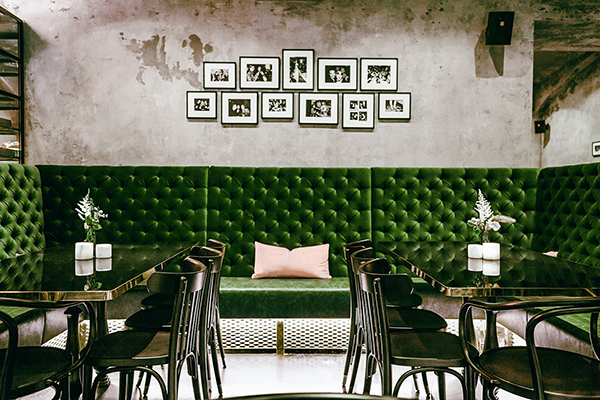
The first photo shows a banquette upholstered in dark, rich green velvet in Motto restaurant, Vienna. The clever mix of the raw concrete walls against the luxurious velvet is a marriage made in heaven!
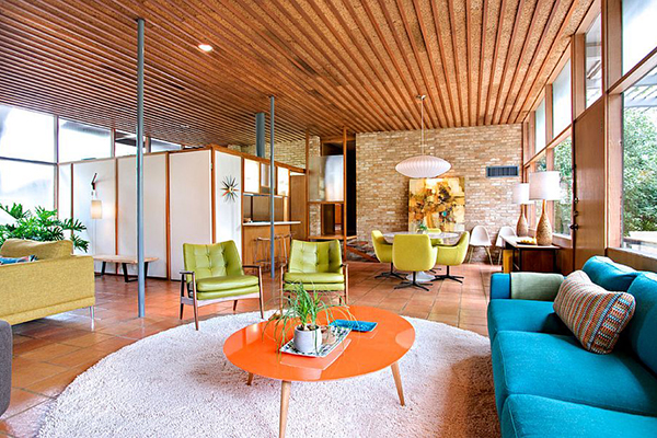 Another earthy, strong colour we’ll see more of is terracotta. Yep, it’s back but don’t just think tiles or terracotta pots because this versatile colour can be used in so many interior spaces. It looks amazing teamed with teals, greens and blues or even purples and pinks. If you’re feeling bold, try teaming it with a predominantly black and white colour scheme.
Without doubt though, terracotta really comes into its own in seventies inspired interiors (second photo).
So when it comes to colour, there’s no excuse for boring……………………………………..
Inspiration:
James Richardson http://www.jamesrichardson.com.au/
Photos:
Motto Restaurant Vienna http://www.motto.wien/
Decoist http://www.decoist.com/terracotta-floor-tiles/
Colours Taking Centre Stage in 2017